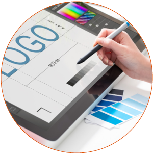
YOU’RE LOOKING GOOD, OR AT LEAST YOU SHOULD BE
Just as most people like to present themselves in a good light, positioning your brand to make a positive impression takes work. In fact, the way your business presents itself plays a key role in how you’re received by your target audience. An overall aesthetic that’s sharp, eye-catching, modern, and memorable will help promote your brand and ensure your business is top of mind when it needs to be. That must be accompanied by great content. Beyond your website, here are three (out of many) areas to review and potentially upgrade:

YOUR LOGO/BRAND MARK
Your logo is a visual representation of your brand. A clean, sharp logo will set you apart, help tell your brand’s story and become ingrained in the minds of your intended audience. Your brand’s logo should be unique and play well with all media. It should make a statement and let your audience know about your business. Think about the Nike Swoosh. It’s memorable, it creates interest, and it has become synonymous with the brand and the company name.
A great logo is versatile; it should look just as sharp on your business card as it does on a highway billboard. If your logo doesn’t convey the “brand promise” it should, or if it’s simply time for an update, make that a priority, as your logo/brand mark is truly the foundation piece for so many marketing components.
YOUR MARKETING COLLATERAL
We hear it often: Do we need printed marketing materials? Our answer: YES! Every business has a need for sales materials. Most of the pieces we create for clients end up as PDF files being used as email attachments and for downloads from a website, as well as commercially printed copies for hard-copy mail-outs and use at events and in-person meetings where a tangible leave-behind still has value. Fewer hard copies (as compared to years past) need to be printed, but when a “wow” marketing piece is needed to make that first impression, you’ll have it.

All marketing pieces should be fully branded with your company’s colors, logo and brand marks. Regarding content, the verbiage should be friendly, informative and “speak” to the reader, focused on WIIFM, “What’s In It For Me?” Sure, the piece will contain background information about your company and its products/services, but it’s also critical to provide details about what you do to help companies, how you solve their pain points and how you provide immeasurable value to those you work with.

YOUR SOCIAL MEDIA FLAIR
While written content is incredibly important for your social media marketing strategy, we also believe the visual elements are equally as critical. A link to a well-written blog post may go unclicked if the accompanying visual graphic is uninteresting. An article may go ignored, where a video may capture the intended audience. A crisp and original animated graphic may stop the scrolling thumb in its tracks. An informative data visualization or infographic may provide jaw-dropping statistics in an easy-to-digest visual format.
The visual assets on social media help catch your audience’s attention. Draw them in with the design and then hook them with your exceptional written content! Make sure your written message lines up well with your visual message, to ensure everything is clear and concise. Whether you want to close the deal on a social media platform or funnel your prospects to your website, the visual design elements can be wildly effective bait.
Brand positioning has so many facets, including graphics, colors and branding elements that help paint the picture of your company and what your team does. If you would like to discuss strengthening your brand, let’s talk. Our team takes pride in doing that every day.
Quote of the week:
Your brand is the single most important investment you can make in your business.
Steve Forbes